Blue Ant International
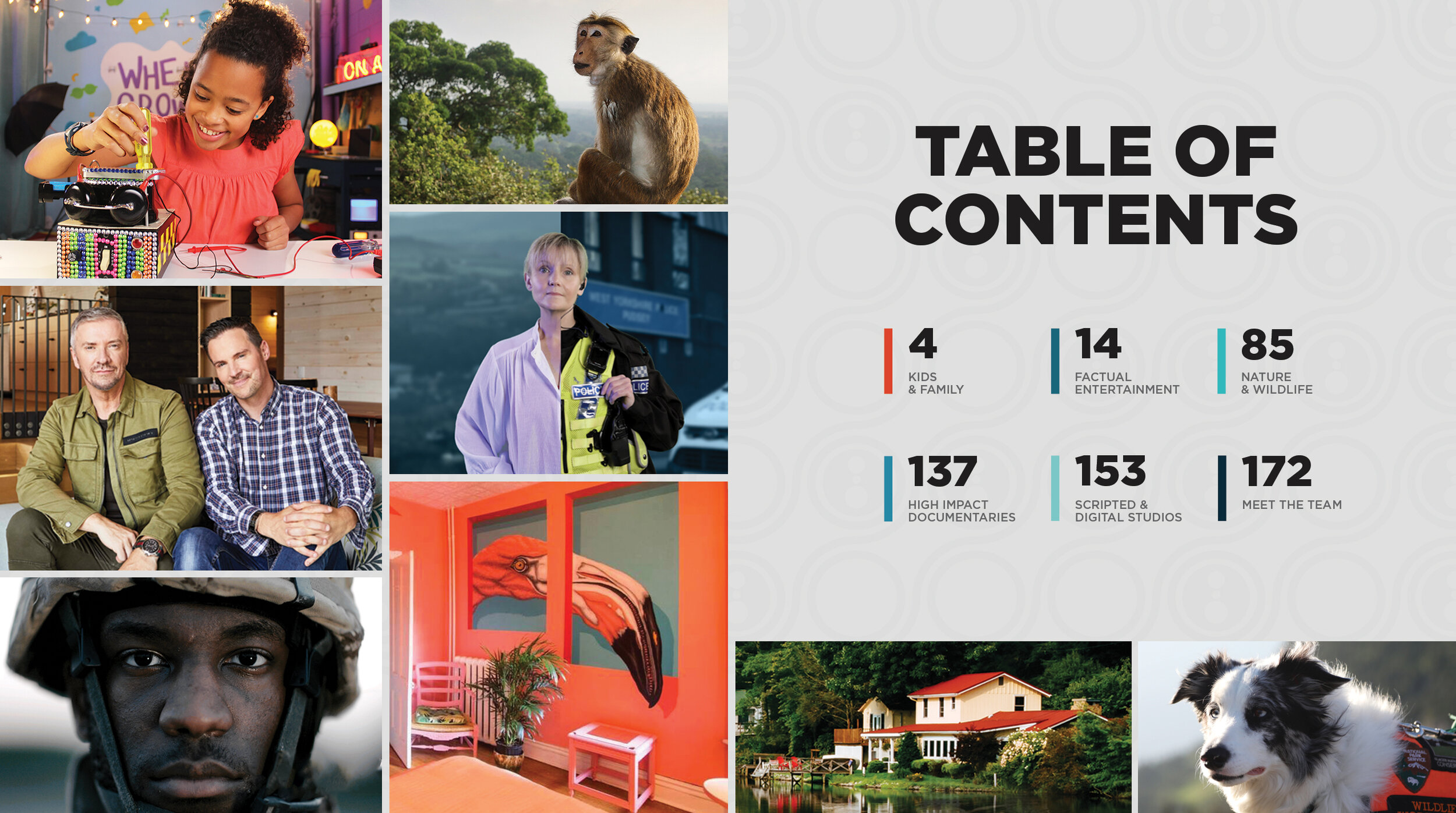
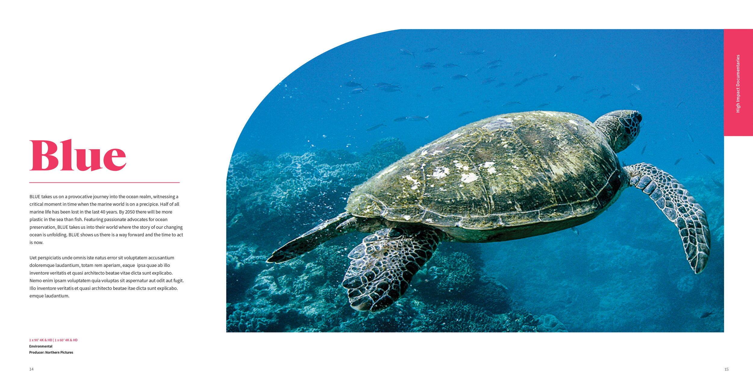
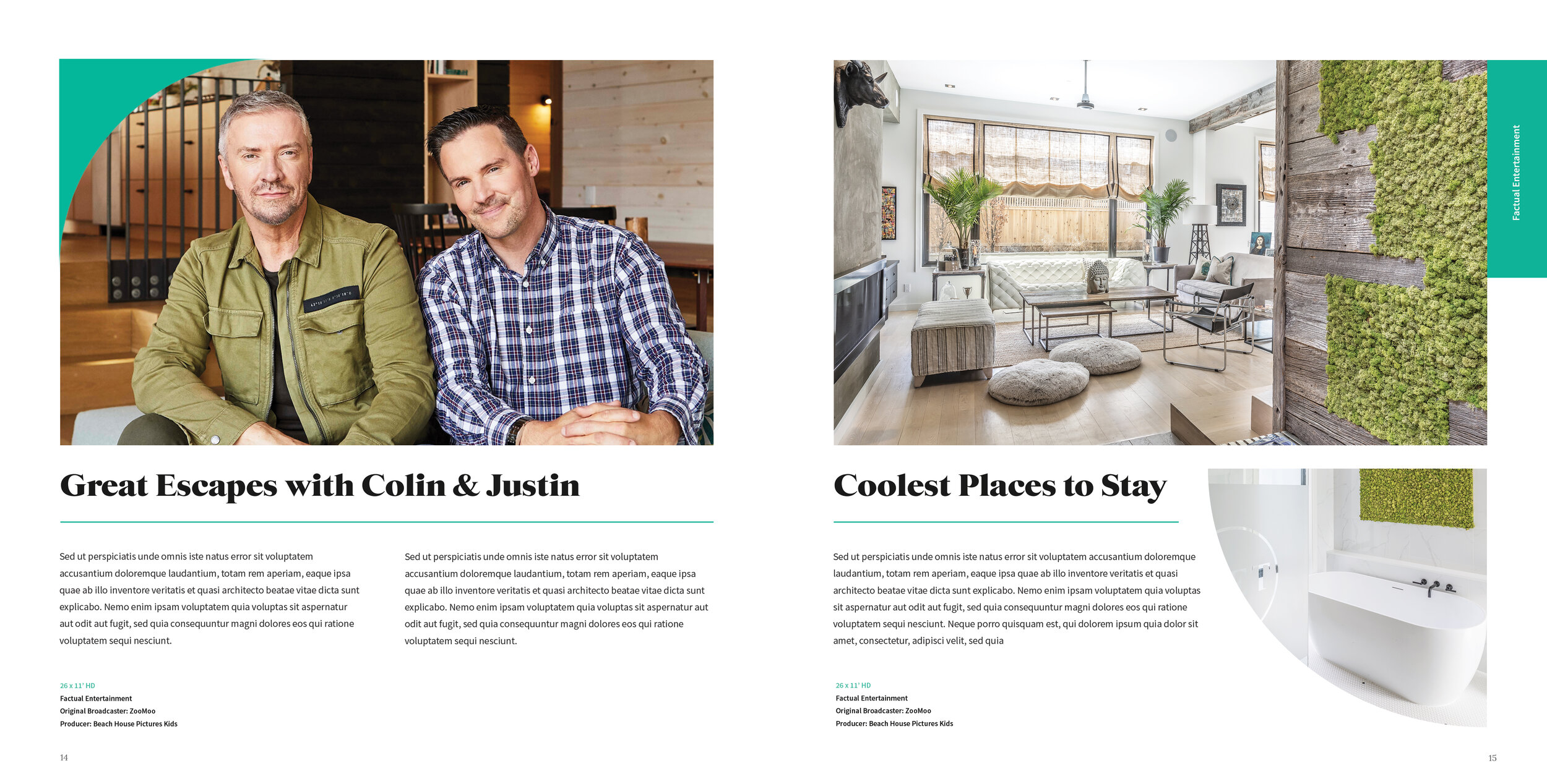
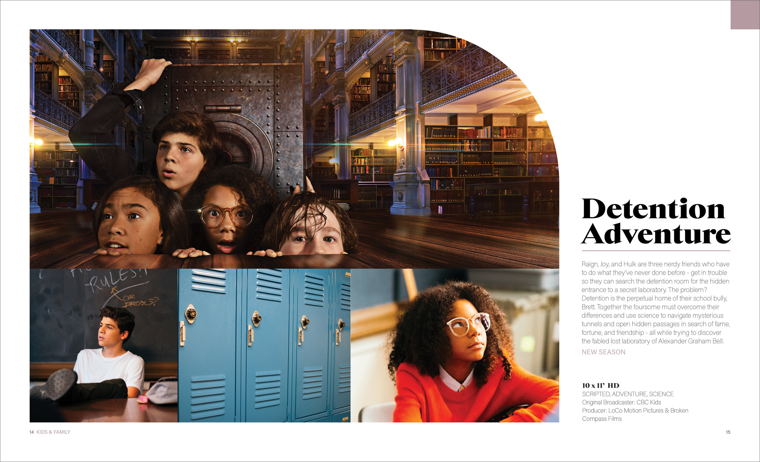
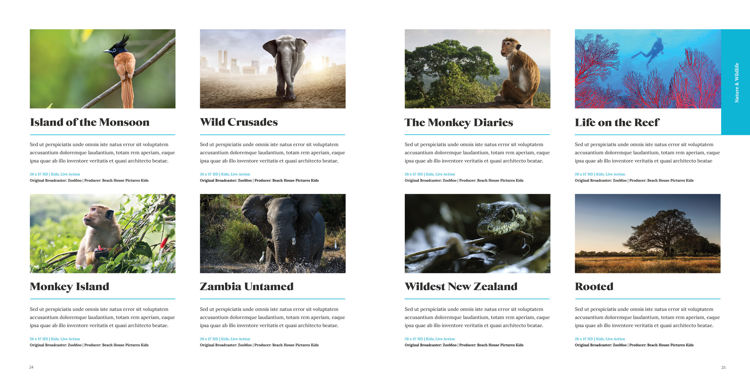
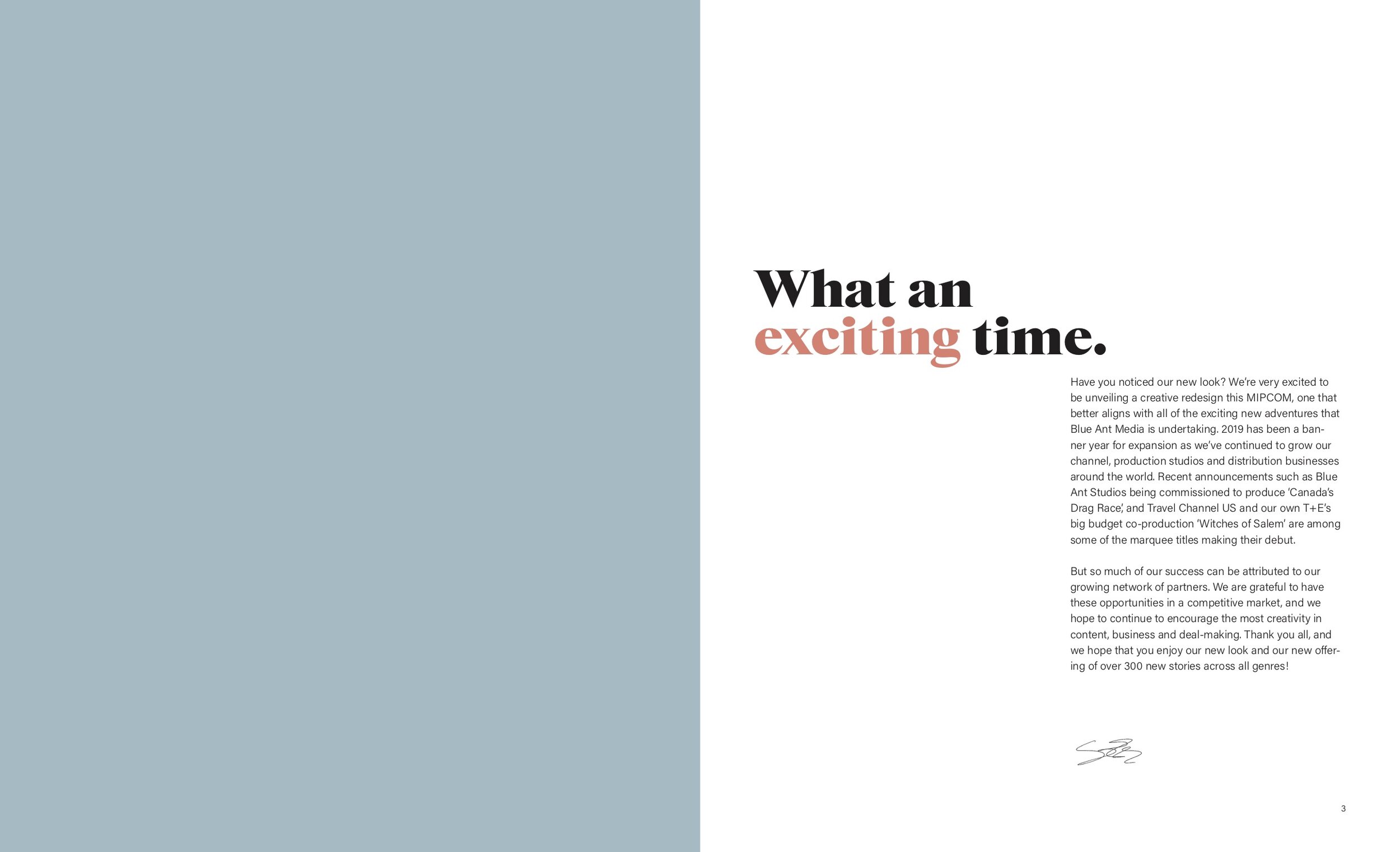
Blue Ant International is a leading global distributor of high-quality content that engages audiences around the world, across multiple platforms. I refreshed their brand with updated colours, typography and design treatments. I also redesigned their 200+ page catalogue consisting of all their television shows.
Art Direction | Branding | Print | blueantmedia.com/distribution
Overview:
The Blue Ant International’s catalogue that exhibits all their shows and handed out to investors was due for a brand refresh.
Challenge:
The task was to create a whole new look for the catalogue including colour, font, layout as well as paper choices for the physical version. Our clients wanted a clean and elegant design in order to stand out in the industry.
Solution:
Keeping close communication with our clients, we brainstormed and mocked up a few ideas. The images below shows our mood boards and drafts. Once our client was ecstatic with the design, we incorporated the new branding into the catalogue.
Result:
Our clients loved the minimalist and editorial look of their new catalogue. A serif font was chosen that added elegance and readability. Moreover, a muted palette was chosen with accented bold colours.


